Assessing The Quality of a Real Estate Photo

I try to spend a few minutes every day looking through MLS listings in my area. I usually do this on Zillow or Coloproperty.com
I am often stunned, for better or for worse, at what I see. Yes, there are some fabulous listings out there, with very talented photographers hired by realtors who know how to spot quality.
Some realtors, though, I wonder what was going through their heads. Realtors, I believe, often don’t really know what to look for in a photo to assess good vs. bad – and what makes the best photos stand out.
It’s a combination of things – not every photo can be great because of one aspect alone. Everything has to come together to make it good. On the flipside, if one thing is “off” ig can ruin an otherwise good photo. At the very worst, some photos do everything wrong.
Related Post: HDR vs Using Lights – Photo Examples
Things To Look For in a Real Estate Photo
Please note: These photos were ***NOT*** taken by me. Correcting the mistakes below will go a long way in making a good real estate photo.
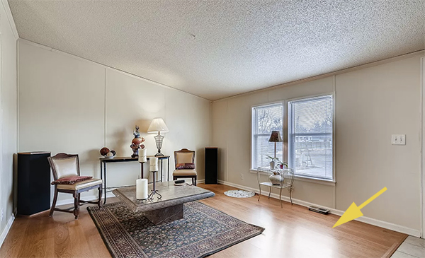
Nasty Color Casts – Are white surfaces actually white?
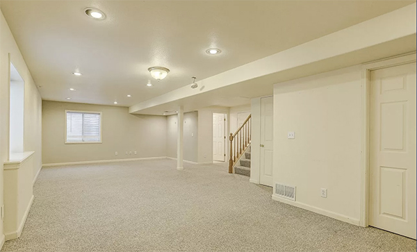
This is inexcusable to me. It is so easy to properly color balance a photo. This picture was certainly run through an automated HDR program that “thought” for the photographer. This takes 2 extra seconds to properly balance, and make the white surfaces in reality actually white in the photo. This photo was on a listing for one of the top realtors in my area which was a little disappointing.
Can you see into far rooms or are they a deep dark mystery cave?
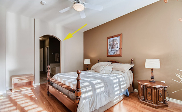
Gross, Contrasty Ceilings
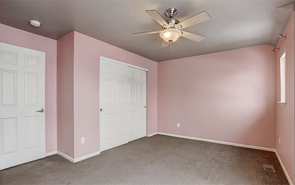
Would you want to hang out in this room? I doubt the ceiling actually looks this way, but oh my. Another photo produced by a “top realtor” in my area. This is again where the automated software is making bad decisions about the photo, and there was no human involvement in the processing at all. White ceilings should be that – white. Or whatever color they are they should be in the photo.
Noisy, Un-necessary Shadows
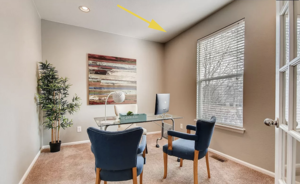
Very few Real Estate Photographers use lighting. I do. Lighting is a simple way to remove color casts, nasty shadows, and noise. However, you have to learn how to use lights, and use them well so the photo does not turn out ‘flashy.’ This photo looks like someone spray-painted the whole top of the window.
Blown-Out Highlights
This is another example of relying only on ambient light, and not using any external lighting. The camera will over-compensate for the darker parts of the room, and thereby blow-out the brighter parts.
Are vertical lines straight?
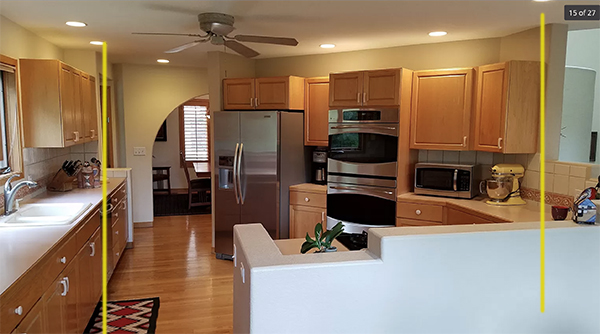
Was the picture taken with a Cell Phone?
See above photo. Clearly.
Are important window views grainy, contrasty or blown out?
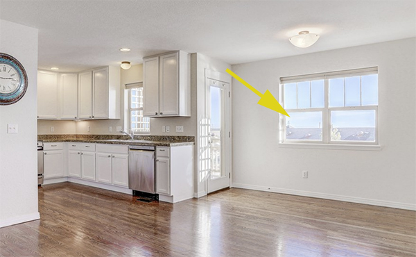
These are some of the top ‘mistakes’ or ‘lazy ways out’ that are common in Real Estate Photography. Working on these issues and correcting them (most often by using lights properly) the photos could have been acceptable, or even superb.
When your photographer delivers your next round, look for these things and then ask yourself if you got the best photos possible.
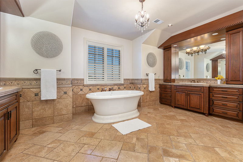
A proper real estate photo:

2 Comments
at
at